Virtual Design and Sales: How it Works
by Barbara Schmidt

Right now our design team is hunkered down in our homes working on various projects. We are designing, writing and strategizing for our clients. The amazing part of our new world is how earnestly everyone is trying to communicate and stay in touch. Here is a great example of our clients at work:

1) Live Action
Today, I’m watching not just one, but two virtual open houses with our client - Real Estate Agent Mark Grieger. This is a whole new arena for homebuyers and sellers in Minnesota. Now, we can actually watch a virtual tour from the agent while we are safe in our homes.
With Mark’s live Facebook tours we are able to walk through a property and hear knowledge of the market. We can interact with him in real time, and that means we can ask questions and feel all the excitement of these new listings. Facebook live is fun, but it can also show a lot of reality. If you aren’t as polished or comfortable at speaking, create a bulleted outline as a script reminder for your content.
Mistakes are ok--just recover and keep going like Julia Child’s one-take PBS shows. When you are on stage, the audience is rooting for you to succeed, and they have inherent empathy. Remember that when you try to share your craft and emotion around a topic.
2) Personality Plus
Mark is a fire starter--he’s bold and accomplished and one of the top real estate agents in the Minneapolis/St. Paul area. He’s especially known for his Lake Minnetonka real estate expertise with buyers and sellers and he’s passionate about his job. That comes through in video and in his sales materials online.
Mark’s conversations with you help teach about the market and where you fit in that landscape. We knew when we met with him we needed a video on his website to communicate that passion.
It’s no surprise that Mark is great on camera and has a vibrancy for his business. Mark’s emotion needs to come through with all his marketing materials. His advice is even more important now with the market volatility.

3) Color Our World
Mark’s brand is one of the long standing real estate businesses in the western suburbs. His track record is superb and his marketing materials needed to look like that.
We landed on navy blue with an almost banker’s feel with a dose of luxe design. Navy blue is a classic neutral that stands the test of time. Deep navy has strength and looks like deep water with depth and vastness just like Lake Minnetonka.
Deciding on a color is so important for the long haul, and every color has an emotional context. Think about your industry and what color means to you. For example purple is health and healing. Yellow is happy, children’s play, and can be fresh, etc.

4) Logo a Gogo
Logo development is the stamp of approval for your marketing. It’s a visual hello and goodbye. The double “g’s” were a twist on brands that stand for quality like Gucci and Chanel.
We left the weight of the type light handed so it felt approachable and friendly. His tag line is also treated with simplicity in san serif type. “When success matters” is all about Mark’s track record and expertise, and it’s communicated clearly.
Logo development is something that we’ve loved to be involved in for a lot of reasons, but perhaps the most important is that it’s your signature. It’s the one repeatable element that goes on everything. It’s your hello and goodbye in just about every form of communication, so keep it consistent and to the point.
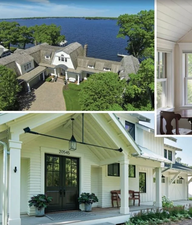
5) Lay of the Land
One of our favorite parts of working with Mark was developing the neighborhood overview. On his website, there is a section that highlights the local charm of the Lake Minnetonka area.
To learn about each area in our own backyard was a gift for our team. Real Estate isn’t just about your property, it’s also about all the other amenities around your area. Location is sometimes more important than the property itself as is the case with Minnesota lakeshore. It got us to thinking about our own firm’s attributes. We pride ourselves on speed and flexibility while we are creating beautiful work for our clients. We are cost effective, too and that’s the name of the game in marketing!